MyMeter part 1: Features
Posted by Grant Bowman on September 17, 2018
As one of Wright-Hennepin’s (WH) Energy Use Consultants (EUC), part of my job is working with members who are having issues with their energy use: they think too much electricity is being used and they don’t know why. In most cases, it is a device or appliance has been recently added or used, and the amount of energy it consumes in a months’ time was not anticipated.
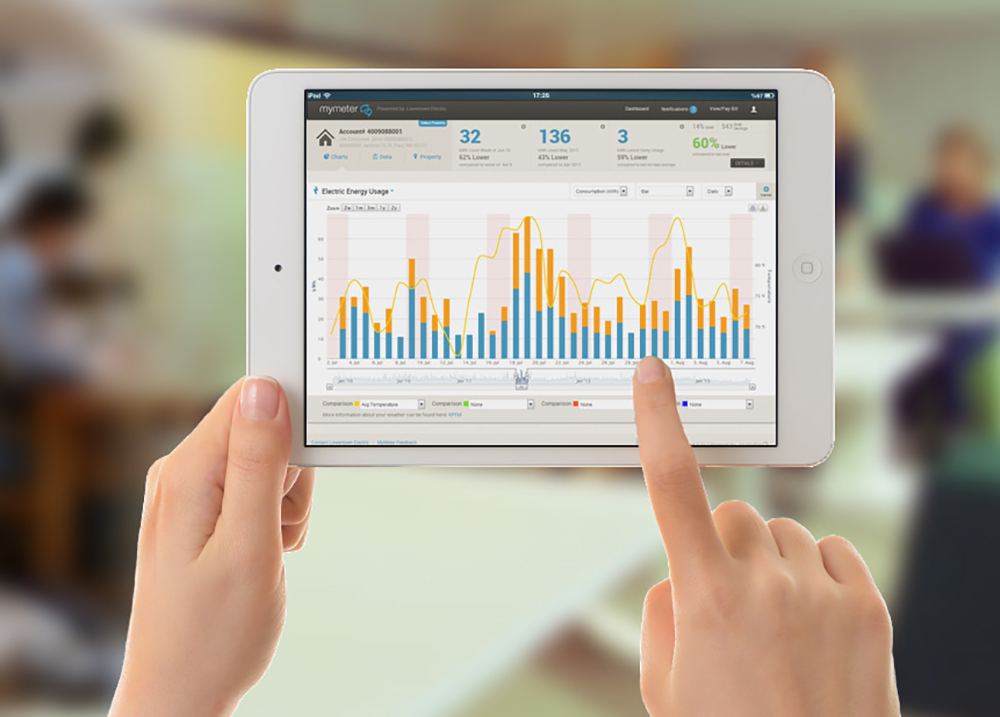
WH offers a free resource our members can use to help them keep track of their energy usage called MyMeter. As a member of WH, you can create a free account on MyMeter and track your daily, weekly, monthly and even yearly kilowatt-hour (kWh) usage!
When receiving a call from a member, MyMeter is one of the first resources I use. I am able to perform an amount of troubleshooting with the program before I even go to the member’s home. MyMeter offers serval customizing features to view specific kWh information. One feature is a bar chart that can be customized according to the user’s desired settings. The settings include:
- Selecting a time range: daily, weekly or billing period
- Selecting usage: total or Off-Peak meters
- Setting a marker
- Zooming: options offered depend on time range selected
In addition, there are four comparison menus where you can choose from a range of options to compare against your usage data, including:
- High temperature
- Low temperature
- Average temperature
- Your usage last year
- Your usage 2 years ago
- Your usage 3 years ago
- Utility average
- Neighborhood average
These comparisons appear as color coded lines on the bar chart.

Another feature is a data sheet that displays your usage similar to a spreadsheet and can also be customized.

The data sheet features:
- Selecting a time range: day by week, day by month or bill by year
- Selecting usage: total usage, total meters, general service meter, Off-Peak meter(s)
- Setting a marker
- Setting a date range
- Color gradient key: low usage readings are blue and high usage readings are orange

Over the next few years, WH is deploying new meters to all members. These new meters are capable of breaking down kWh usage by the hour. Once you have a new meter, MyMeter automatically updates to allow you to further beak down and analyze your energy usage throughout the day.


Look for MyMeter part 2 for tips on how to put your MyMeter data to use!
Learn how to use MyMeter with these helpful videos!